Tuesday, November 27, 2012

Lab 8

This week, the objectives include using ArcGIS to analyze natural disasters or emergencies and to analyze how the emergencies affect life in Southern California.


The objective of this lab was to use GIS to analyze the effect of natural disasters. This lab showed the potential of GIS when trying to analyze the affects of the disaster on the surrounding geography, and also the potential of GIS to analyze the causation of the natural disaster. This lab centers around the 2009 LA county station fire. The fire, which began on August 26, 2009 was not successfully contained until October 16, 2009 and burned upwards of 160,000 acres in the process. The first map shows the area of the start of the fire as the yellow polygon, and the area 3 days later as the purple polygon. What these maps analyze are two of the major causes of such a large fire, slope and fire fuel in the surrounding areas.

As shown in the first map, the fire began relatively close to the 210 freeway, one of the major interstates in the Los Angeles area. However, according to CNN, a lot of the inhabitants of the nearby areas have evacuated and many lives were saved. This map shows how the fire spread in relation to major freeways and major cities in LA county. Also this map shows the slope of the terrain in relation to the spread of the fire. Fires spread faster going uphill (howstuffworks.com 4) because the heat from the fire travels up due to air density (hot air rises), which preheats the fuel on the slope above the currently burning fire. So this map shows how the fire spread due to slope as well as how it spread in relation to the populated areas of LA county. Luckily, the fire spread north due to the hills north of I-210 and the subsequent abundance of fuel that lied on the hills above.


In the second map, the rankings of fuel (i.e. underbrush, trees, vegetation, anything that is flammable and dry) is shown in LA county. As seen by the color distribution, where the darker red areas contain a lot of flammable vegetation, the fire spread quickly with so much available fuel to burn. According the the Fire and Aviation management, the weather during the outbreak of the fire was not particularly windy(fs.fed.us p.8), so the fire was not wind aided in is travel across the county. This means that there had to be another source for the fire's quick spread. As can be seen on the second map, fuel resources in the area of the fire outbreak is a very reasonable explanation of the quick spread of the fire. The fuel rankings of the area in between the green polygon and the yellow one (outbreak) is ranked high to very high. This means that there is an abundance of fuel for the fire to burn without the aid of wind. This map shows that, as analyzed by Randi Jorgensen of the forest service, “this fire’s very different… It’s not what we typically get. It is not a wind-driven fire.” (cnn.com)

Overall these maps showed two of the most important aspects of the spread of wildfires, slope and vegetation that can be used as fuel. When the information of the two maps is combined, it can be easily seen why the fire spread the way it did. The fire spread north where the hills were (elevation increase) and where the fuel ranking was highest. This means that in addition to the fact that fires do run uphill faster, there is more flammable vegetation on the hills. This means that the fire was primed to spread north and spread quickly. Luckily, as seen in the first map, the fire spread away from the heavily populated areas and toward the less inhabited areas of the county.

What can be deduced from this lab is the importance and potential of GIS in analyzing natural disasters or emergencies. Layering data in GIS can show the geographic relationship of things a lot easier than describing without maps. GIS allows easy to read evaluation of data and its spatial relationships to other data. For instance, it is easy to see how the fire related to the major highways of the area by just looking at the area the fire spread to overlaid with a layer showing the major interstates of LA county. ArcGIS could also be a powerful tool in analyzing the effects of widespread emergencies such as epidemics, hurricanes, and famine. In the end ArcGIS simplifies the collection and presentation of data for further analysis, just like when dealing with the station fire.

references:
"HowStuffWorks "How Wildfires Work"" HowStuffWorks "Science" Web. 12 December 2012.     <http://science.howstuffworks.com/nature/natural-disasters/wildfire.htm>.

"'Angry Fire' Roars across 100,000 California Acres - Page 2 - CNN." Featured Articles from CNN.
31 Aug. 2009. Web. 12 December 2012. 
<http://articles.cnn.com/2009-08-31/us/california.wildfires_1_mike-dietrich-firefighters-safety-incident-commander/2?_s=PM:US>.

Archibold, Randal C. "After a Devastating Fire, an Intense Study of Its Effects." New York Times. 2   
Oct. 2009. Web. 12 December 2012

Last, Irving. "2 Firefighters Killed Battling Blaze in Los Angeles County." CNN.com. Cable News Network, 31 Aug. 2009.  Web. 12 December 2012. <http://www.cnn.com/2009/US/08/30/california.wildfires/index.html?iref=allsearch>.

United States. Department of Agriculture. US Forest Service Fire and Aviation Management.Station Fire Initial Attack Review. US Forest Service Fire and Aviation Management, 13 Nov. 2009. Web. 12 December 2012


Tuesday, November 20, 2012

Lab 7


This map shows Black population density in the United States using US census data from 2000. In this map, the lighter the color, the less dense the area is with African-American population. As can be seen in the map, the most dense area is the southern US, especially in Louisiana, Georgia, South Carolina, and Alabama. There are other pockets with medium density around Los Angeles and New York. Overall the census data clearly shows where large areas of blacks live, mainly in the southern US and near the coast. From here, other population dynamics can be clearly calculated.


This map shows the percent of population of other races by county in the United States. What "other races" means is the percent of races without their own subcategory on the census survey form and are grouped into a larger category. This map charts the population of each county based on the percent of their population of other races. What can be seen by this map is that the larger populations of "other races"is in the western portion of the US. There is a little density in Florida, and that constitutes the largest density on the Eastern US. The large portions still reside in the western US despite the portion in Florida.


This final map shows the population density of Asians, in percent, per county in the continental US. In this map, the largest portion of Asians exist in California, with other large portions existing in the North East, nearby New York City. There is also a pocket of large Asian population in the Houston Area in Texas, however the largest density of Asians exist in California, as evidenced by the darker colors on the west coast.


Overall the census data map series is very informational and provides a readable and clear way of representing population data on a map. This works because the data covers a large area while still showing via colors how dense the population of that race was in that county, with the colors fading to white as the density went down. Overall the display of the census data via maps and raster data provides a clear and effective display of the information for further analysis and observation.


Going into this class, ArcGIS seemed very intimidating, and the interface seemed confusing and hard to grasp. However, with a lot of practice, I can see the vast potential this program has. With the proper knowledge and technical know-how after practicing with the program, spatial information can be effectively displayed in a clear and presentable manner using ArcGIS. While this program can be time consuming and confusing for the user at times, the potential for quick and readable data as well as complex data presented in a simpler manner can be seen. Data or information of location, distance, and other spatial attributes can easily be related to other non-spatial data such as population density, and then presented in a reader-friendly manner in order for a more profound insight into the subject to be attained.


Tuesday, November 13, 2012

Lab 6


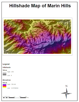
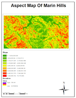
In this lab, 3D models and raster data are being used to create 3 maps and a 3D image of a location of my choice. For this map, I selected an area north of the San Francisco Bay because that is a very beautiful place and this location just so happens to have a lot of elevation change and hills which would provide good data for this exercise. While the scale is a little small, there is still a large elevation change that can be seen in the maps above. The extent of this area is 37.909 degrees North to 37.958 degrees North and -122.666 degrees West to -122.572 degrees West. The geographic coordinate system of this map is GCS North America 1983 and its angular units are degrees.

Tuesday, November 6, 2012

Lab 5

For this lab, all distances will be in Miles

 Conformal Projections:


Washington D.C to Kabul Distance
Planar: 10,112.12
Geodesic: 6,934.47
Loxodrome: 8,112.061
Great Elliptic: 6,934.48


Washington D.C to Kabul Distance
Planar: 9,878.03
Geodesic: 6,934.48
Loxodrome: 8,112.06
Great Elliptic:6,934.48


Equidistant projections:


Washington D.C to Kabul Distance
Planar: 6,972.5
Geodesic: 6,934.47
Loxodrome: 6,972.5
Great Elliptic: 6,934.48


Washington D.C to Kabul Distance
Planar: 6,648.75
Geodesic: 6,934.47
Loxodrome: 6,648.75
Great Elliptic: 6,934.48


Equal Area


Washington D.C to Kabul Distance
Planar: 8,098.07
Geodesic: 6,934.47
Loxodrome: 8,112.06
Great Elliptic: 6,934.48

Washington D.C to Kabul Distance
Planar: 10,108.05
Geodesic: 6,934.47
Loxodrome: 8,112.06
Great Elliptic: 6934.48


For this lab, six different maps were created using ArcGIS and each map was a different type of projection. Some projections were recognizable and others were very unusual, however each map had its own purpose and fit into a certain category. For this lab, 3 different map projection categories were to be shown, with 2 different projections for each category being put on the page. The three categories are: equidistant, equal area, and conformal. Conformal maps preserve the angles between the longitude and latitude lines and can be recognized by the 90 degree angles of intersection between longitude and latitude lines, equal area projections keep the relative size of countries the same, and equal distance projections keep the distances between points at close to or at exactly their calculated value. For this lab, mercator and stereographic projections are shown for conformal examples, sinusoidal and cylindrical equal area maps were used for examples of equal area projections, and the equidistant conic and the 2 point equidistant projections are used to give examples for equal distance category.

There are some clearly significant things that come with choosing a map projection. The first of which is distance between two points and choosing a type of measurement to find the distance. The earth's imperfection in terms of geometry makes calculating distances tough, and on the 2D projections of the earth, there are 4 different distance measurements that can be given. What is constant between all 6 maps above are the Great Elliptic distances between Washington D.C. and Kabul, which comes out to 6,394.48 mi. When looking at distance, the maps with the most accurate readings are the 2-point Equidistant and the Equidistant Conic because their distances are preserved, with the other types of measurements staying near the calculated distance of 6,394 mi. However if distance is the goal being examined, the conformal and equal area projections are not quite accurate and hence provide an example of one pitfall in the process of projecting the Earth's surface into a 2D model. What that means is that if one needed to use a map, the right projection must be used, and if accurate distances were the goal to strived for, map projections such as the Mercator Conformal, and the Sinusoidal Equal Area projections would not be appropriate choices for this purpose. The problem with limiting the amount of projections that can be used for data collection and observation is that now one other factor has been neglected when choosing that type of map. In this case, if one were to use the 2 Point Equidistant map, the angles between latitude and longitude would no longer be preserved, and some issues can arise, such as in navigation, bearings would be all wrong and the heading of a ship can be in the wrong direction. What matters is that each projection contains both potential and pitfalls, and in that case the proper projection must be used with a certain goal.

As seen before, the importance of map projections is clearly stated, and there are some overall potentials to having map projections. For starters, map projections allow users to easily read and access information in a 2D platform. That means computers are not necessarily needed to read and scrutinize map projections, and therefore are available to a much larger demographic. Next, map projections can specialize the information on a map to only what is desired by the user. For instance, if the user wanted to find the relative areas of countries in Africa, the Cylindrical Equal Area projection can be used because the areas between land masses are kept equal with respect to one another. That means what can be seen from this projection is the comparative size of countries in Africa to countries of Europe. For equal areas, the user would not want to use the map not designed to keep relative areas accurate, such as the Mercator projection or the Stereographic projections because the data given would be inaccurate. When looking at the Stereographic projection, the USA looks bigger than all of Africa, however in the Cylindrical Equal Area projection and the Sinusoidal Projection, the USA is clearly much smaller than Africa, which is the more accurate representation of the land masses. Overall, there are problems with map projections however the potential of easy to read and well presented data are very much a part of map projections.

Overall, there are potentials and problems with map projections in general. All of which stem from the fact that the earth is a 3D object trying to be projected onto a 2D space. On top of that, the Earth is full of lumps and does not make a perfect geometrical shape that is easy for projecting onto a 2D surface. It is because of this that these projections must sacrifice the accuracy of one aspect to ensure the accuracy of another. That means a clear goal must be focused on when trying to choose a certain map projection because if the wrong projection is chosen, the data that is obtained could be inaccurate. However when analyzing the different projections in ArcGIS, choosing a certain projection is much easier as shown by this exercise because ArcGIS allows multiple maps to be compared and contrasted in order to find the right projection without too much of a technical struggle. This exercise was concise, and provided a good introduction into the powerful uses of ArcGIS as a tool.


Sunday, November 4, 2012

Lab 4


ArcGIS is an instrument that provides tools to people to understand and analyze spatial relationships between objects and data that links through location. The locations and their relationships can be represented in ArcGIS using points, lines and polygons and also cells with different represented data in each cell. While this may sound confusing, ArcGIS is extremely useful when analyzing data that relates to location and spatial representations. The trouble comes with first encountering the program, because it seems daunting at first. The tutorial was 50 pages at least, however it walks the reader through each step in great detail. That by itself was not enough to begin to master ArcGIS, the true way to learn the program is to actually perform the tasks required and to struggle through encountered problems to come away with a greater understanding of how the program works. Only then can a greater understanding as to the significance of this set of tools is to understanding and analyzing spatial relationships.

There is quite a lot of potential with ArcGIS once the user masters the nuances of the software like layering data onto datasets, manipulating data tables, uploading the data to present in ArcGIS, and integrating data from multiple sources, the potential of ArcGIS can finally be realized. In this lab, we layered data about the noise contour of an airport, and its potential effects on the surrounding neighborhood. This is just one of the potential uses of GIS, and because the user gets a bird's eye view of the area being analyzed, the spatial relationship and the extent of the noise effect on the neighborhood can be easily determined. This type of analysis can also be useful in subjects such as urban planning, farming and land use, emergency response, and navigation for travel, to name a few. The potential resides in the fact that GIS allows the user to layer data obtained from multiple sources look at how the data relates to each other in a spatial manner. They can see how their crop of wheat is affected by the temperature increases over the past years to gain a better understanding of their crop for the future, a meteorologist can layer rain patterns on a map of California and relate the rain to different seasons of the year. With this lab, GIS could be used to inform people of the neighborhood how expansion of the existing airport would affect their lives.

However, there are some pitfalls associated with GIS, beginning with overcoming the scope of information that must be presented. The user must be aware that massive amounts of data could be used, and to begin step-by-step with the process of presenting and layering the data that relates to each other. But that pitfall isn't even the beginning, because to begin with there are some nuances to know about the system. First, especially with this lab, the data must be saved together using some sort of flash drive because if a different computer is used each time, the work will not be updated and the user will have to start over each time. On top of that, a lot of hours are spent just trying to get acquainted with the interface because there are so many different toolbars, editing features, layout features, and view perspectives that must be utilized to present the information in a readable, user friendly way. Then comes the frustration with utilizing all of the aspects of the software like zooming in on a plot of land which takes away the overall relationships between objects and then not knowing how to get the old view back, and that provides some users with a lot of frustration at the software. Finally the amount of memory GIS takes up is quite a handful, and that comes from the shear amount of data being put into one application. All of these pitfalls seem overwhelming, however the final product does give a good presentation of data in an easy to visualize way.

Overall, GIS is an incredibly useful tool to represent spatial data and relationships between objects on a large scale. While the software may be costly in time and memory space, the finished product provides a better understanding of the spatial relationships between locations and objects. At first it is hard to understand and grasp the interface and the data management may seem frustrating, but when needing to deal with large projects such as natural resource management or land surveying, using GIS is the easiest way to present and analyze data on a large scale basis. With GIS all of the data is can be seen in one easy to analyze overview and therefore can be manipulated and scrutinized as the user sees fit. The professional way in which the data is represented makes an amateur user feel overwhelmed because of the massive amount of time needed to master the software, however the final product of a well presented and easy to read map is well worth the initial struggles of the software.


Tuesday, October 16, 2012

Lab 3


View 2012 Summer Vacation: Dubai and South Africa in a larger map

This map is an example of what is called "neogeography", which is when a non-expert uses geographical techniques to display information in a non-formal or analytical way. There are some benefits to neogeography, such as the availability of the information. Since the creators of such information tend to be non-experts or non-professionals, the information can usually be accessed by most anybody. Also, the topics of the information being presented also differs from professional data and the topics tend to be less mundane. With neogeography, maps can be made to present anything, whether it is some one's vacation, or the list of nightclubs that one went to over the span of a month. These sort of topics are not ones that professionals take up and research, and therefore are usually presented in a less scholarly and informal way.

While neogeography may present more creative ideas to the normal scholarly geography, there are some pitfalls that present itself in this subject. With amateurs creating geographic projects, the data could be skewed and prove to be inaccurate. Also, professional data is always done with the main objective of presenting the data and not being artistic. Amateur work can try to be artistic first, then be hard to read and provide no tangible information. However, neogeography has a lot of potential. Neogeography allows out-of-the-box thinking and allows all people a chance to read all sorts of information as opposed to just scholarly work.


Tuesday, October 9, 2012

Lab 2

1. Beverly Hills quadrangle

2. The adjacent quadrangles are 1. Is Canoga Park, 2. Van Nuys, 3. Burbank, 4. Topanga 5.Hollywood 6.nothing 7.Venice  8.Inglewood.

3.Topography was compiled in 1966

4. Datum used is NAD 27 and NAD 83

5. 1: 24000

6.
    a) 1200 meters
    b) 1.89394 miles
    c) 2.64 inches
    d) 12.5 centimeters

7. Contour interval is 20 feet

8. a) 118/26/21 W 34/4/26 N
   latitude 34.074133
   longitude 118.439312

    b) 118/29/60 W 34/0/30 N
         lattitude 34.007455 N
         longitude 118.49 W
    c)Longitude 118/24/30 118.4083 degrees
        Latitude 34/7/0 34.1167 degrees

9. a) 570 ft, 173.736 meters
    b) 140 ft, 42.67 meters
    c)  650 ft, 198 meters


10. zone 11

11. 3763 northing and362 easting

12. 1000m*1000m= 1,000,000 sq. meters

13.


14. 14 degrees

15. South


16.